Colour not matching your print? Lighting, CMYK, substrates and ink types all play a role.
Although we ask for print ready artwork, if you need some help we can handle the colour science and you enjoy perfect print.
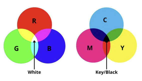
If you’ve ever wondered why your printed colours don’t always match what you see on screen, you’re not alone. Colour accuracy is one of the biggest challenges in professional printing, especially across different machines, inks, materials and lighting conditions. You’ve also got to remember that your screen uses light so you get RGB and printers use ink so you get CMYK.
At RMC Digital Print Limited we have in-house in pre-press services, colour management, and high-quality printing designed to give our clients the most accurate, consistent results possible.
Whatever wide format print you’re after be it signs, exhibition displays, interior décor or set graphics understanding pre-press and colour management is essential for achieving the best results.
How light affects printed colour (Metamerism Explained) – our Ray is an expert on this
One of the most common and most misunderstood reasons colours change is lighting. In the print industry this is known as metamerism.
Colours look different under:
- natural daylight
- warm indoor lighting
- cool LED lighting
- fluorescent retail lights
This means the same printed colour can appear:
- more yellow indoors
- more blue outdoors
- more muted in shadow
- more vibrant under gallery or showroom lights
This is crucial for UK businesses producing retail displays, signage, promotional graphics and branded interiors where lighting varies dramatically from location to location.
At RMC, we review colours under various conditions to give you an accurate preview of how your print will behave in different environments. We’re old school with this and print swatches then test them in different environments. There is software that can do this for you but so far, we’ve not found anything that works as good as the eagle eyes of our production team. It’s interesting to know for numerous brands we have an indoor and an outdoor Pantone reference to make sure it looks like it’s the same colour.
Why CMYK colours differ between printers
Many UK clients assume that because they supply CMYK values, every printer will output the same result. Unfortunately, CMYK isn’t universal and here’s why:
Each printer uses different:
- ink types
- print heads
- calibration systems
- substrates (paper, vinyl, board, fabric, etc)
- drying/curing methods
These differences mean that one set of CMYK values can produce multiple variations of the same colour. So when you give us a coated litho print to match to an uncoated UV print it’s never going to match 100% but we will get the best bearing in mind the different print methods. In regard to substrates they have a different white points so don’t start off the same shade of white so when printed aren’t the same shade of colour. We can get around this by printing a layer of white ink onto the substrates which gives them the same starting shade of white.
Pantone & Swatch Colours – Useful guides, not absolute matches
Pantone guides and swatch books are valuable tools in colour specification, especially for brand consistency. But in practical UK printing environments, they have limitations.
Pantone colours change depending on:
- printing method
- ink chemistry
- the material being printed
- gloss vs matt finish
- environmental lighting
A Pantone printed on coated paper via litho will NOT look the same as a Pantone printed on vinyl using UV inks — even with perfect colour management. Open your Pantone book up and check the difference between the coated and uncoated colour. Sometimes it’s difficult to believe the coating is the only difference.
That’s why we recommend:
- reviewing physical proofs
- checking colours under correct lighting
- discussing print methods before production
- matching expectations to the specific substrate
Why “Print-Ready Artwork” Is Often NOT Ready for Print
This is one of the biggest problems printers face in the UK.
Common issues include:
- incorrect resolution
- RGB images instead of CMYK
- missing bleeds
- low-quality images
- spot colours not converted correctly
- embedded profiles missing
- flattened artwork with transparency errors
- incorrect PDF settings
Although we ask for print ready artwork our pre-press team at checks every file for:
- resolution
- colour space
- file format
- bleeds and trim marks
- ICC profiles
- font embedding
- artwork alignment
So, we may throw your artwork back at you to improve but it’s better than us printing what is there when we know it’s not correct, so your final print comes out right. We always ask for vectored files where possible as this lets us scale them up without losing any quality.
As a trade printer we do stress that we print what you give us but that being said if we notice a problem we always flag it up.

